film poster planning-colour theory and fonts
Colour theory are the 'rules' which designers use to communicate with users through appealing colour schemes in visual interfaces. To pick the best colours every time, designers use a colour wheel and refer to extensive collected knowledge about human optical ability, psychology, culture and more.
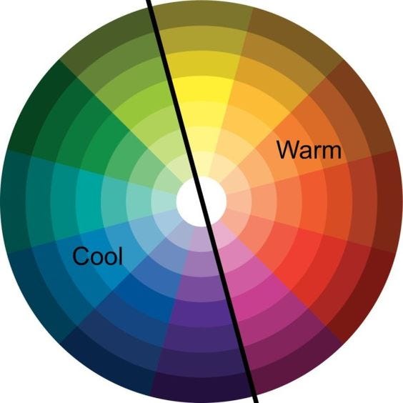
For our project, as the genre is horror, we're going to use darker colours to connote fear and a thrilling sense to our poster.
Some colour combinations that I think could go well for our poster are: Dark blue and dark yellow, as you can see they oppose each other in the colour wheel, the dark blue could create a spooky effect as it alludes to the night sky and the dark yellow slightly creates a contrast of stars/planets, together this gives the impression of nighttime.
Another combination I like for our poster is green and red as the red obviously could represent blood and the green could allude to the outside, furthermore this also supports the idea of loneliness as the the allusion to the outdoors in a horror genre setting could represent being lost or stuck in the middle of nowhere.

Font:
Helvetica Neue 93- one of the most common fonts, due to it being so popular i probably wont use this as i want my poster to standout and capture the viewers eye and interest

Rama Gothic M Heavy-Quite a good 'indie' style font but doesnt quite fit in with the theme of our poster

Garamond Premier Pro Light Display-

Dark and black Regular- This is one my main contenders for the film poster as the style would go nicely with the type of film and genre poster were going to be creating

Bodoni-

Comments
Post a Comment