Film poster: complete
Summary
For the final product I'm very pleased with the outcome, but it did take a lot of work getting there, I changed my original plan a bit as I wasn't able to get an image of a shed/ spooky house to put in the background and so I had to improvise with mainly solo shots of people to cut and put together.
Steps of editing
In regards to the process, I got the image of the mannequin alone and used it as my base and cut out some of the solo shots of each person and layered them on top facing different directions. I did this by opening the solo images separately and using the quick selection tool, inverting what was selected and deleting the background, I then dropped this onto the mannequin image and moved them around until they were in a position I liked.


Next I used the elliptical marquee tool to create a spotlight effect by filling it white and adding the feather effect from around 20-30 pixels: I also started to add some text such as the title and credits and downloaded some fonts that I thought would fit nicely with the poster style.
Draft 1:
This was where I started to add the text and try different fonts and text sizes, however there were still a lot of empty gaps in this draft, especially towards the left side where it felt too empty and incomplete.

Draft 2
Here I added a tag line, an age rating and some fake reviews from newspapers to make it seem more realistic. But the placement still felt wrong as there was still a large gap towards the top left and the text didn't seem right either so I added an outer glow to the title text to make it fit in more.

Draft 3/ Final product
Finally I changed the font again as I didn't think the original font stood out enough and also the colour so that the poster text wasn't predominantly yellow, I moved the reviews to the top of the poster and put the rest of the text in a more central order down the left side of the poster, I also put another spotlight effect on the top left of the poster which ties in the white title text and also shows off the drop shadow effect I placed on the 'release date'.
I am very pleased with the outcome considering I had no previous experience with photoshop.
If I were to do this project again one thing I would change would be to take better quality photos that weren't so dark as it wouldn't be as hard to cut out of the original image if, like in this project, I were to cut them out and place them on top of another image.

Final colours:
All predominantly dark colours/ dark shades of colour e.g dark red and mustard yellow except for white which was used to highlight and create contrast of light and dark.

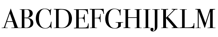
Final font:
Bodoni 72 small caps
A simple font but has an elegance that matches the horror theme of the poster and ties everything together
Comments
Post a Comment